
A couple weeks ago staff member hasawa made a post about CD Jacket art that made her cringe. This is the spiritual successor to that, but as the title suggests this time staff members got together to choose their favorite covers and tell us why they feel it’s the very best. What album art was worthy enough of making the cut? find out for yourself below!
(header image via sekihan)
Alex
Suiyoubi no Campanella – Zipang (2015)
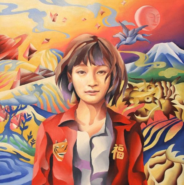
There’s no doubt that “Zipang” is one of the highest peaks of Suiyoubi no Campanella‘s creativity: released in 2015, this record is an exciting and constantly surprising experience that features several different vibes and moods packed together, united by the project’s well known dynamism and unpredictable execution. It’s not common to see so many different sounds and influences cohexisting together in such a natural way, yet Campanella’s farewell record to the Indie scene is one of the strongest showcases of this ability in recent times.
This variegated soundscape is properly represented by one of the most striking album covers of the last few years: “Zipang“‘s art is not only beautiful to see, it’s also an on-point representation of the record’s identity, portraing singer KOM_I in a mythical-looking and surreal landscape where distant elements live together in harmony. The album title has its relevance in the overall art direction as well, clearly referring to the story of “Zipang”, a Japanese island apparently full of precious resources where “The King’s palace is roofed with pure gold, and his floors are paved in gold two fingers thick”, as described by Marco Polo in his book; even here, the album’s cover successfully conveys the feeling of mistery and genuine curiosity of a place that hides something special and unique. This remarkable cohesiveness between music and artistic direction is nothing new in Campanella’s portfolio, and it’s interesting to notice how they used this tale as empty canvas to express their creativity, both musically and visually.
In the end, old man Marco Polo was wrong: Zipang was mostly an island of silver. Yet, this album and its art direction remain a gold mine for the fans of Japanese music.
Ash
Jun Togawa – Tamahime Sama (1984)
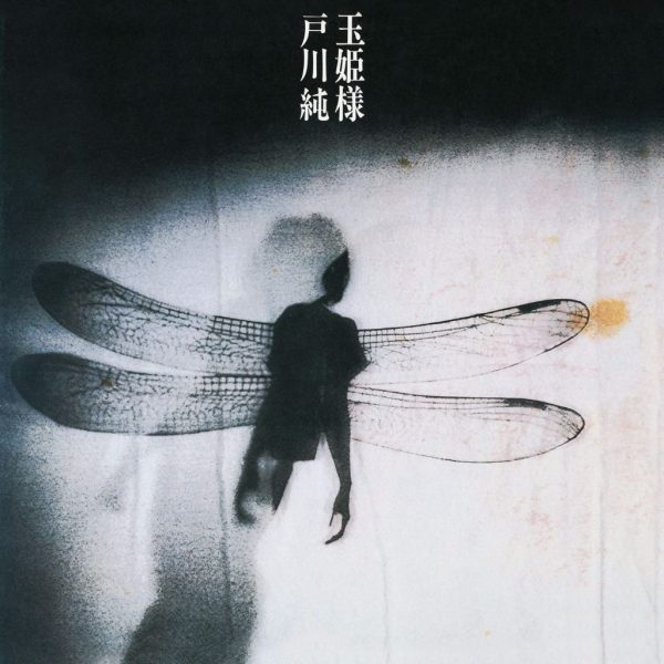
Tamahime Sama for me, is the very definition of an iconic album cover. That unforgettable imagery of Togawa‘s silhouette donning her famous Dragonfly wings (a costume she would don during live shows during that particular era, one of the most vivid and iconic images that come to mind when thinking of the legendary artist) on a stark white curtain is instantly eye-catching and intriguing.
These elements combine to create what makes Tamahime Sama the beast of a record it is, and the cover is truly indicative of the themes (masochism, the menstrual cycle and most of all, the overall arc of the transformation of woman to insect –hence the dragonfly imagery– are just some of the subjects touched upon throughout the cult classic album) and tone of the album.
The sheer bleak simplicity of it makes it her most memorable album cover, and it is one that I always stop to look at when flipping through my record collection.
To this day I still haven’t come across a Japanese album cover that so wholly and truly represents the artist quite the same way as Tamahime Sama did for Togawa. A masterpiece of album artwork design and an amazing one to have in any serious music collection. Unforgettable.
Kano
Akina Nakamori – Fushigi (1986)
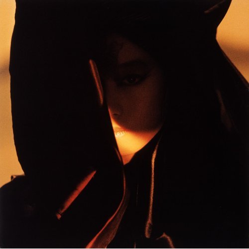
The cover of Akina Nakamori‘s anomalous “Fushigi” stands out for several reasons. Usually an album cover is a gorgeous photoshoot still that may not even reflect the theme or the title of the assigned album and can be easily replaced by its CD / DVD counterpart (commonly spread in j-pop) or a fan art. As for Fushigi, the cover is an inherent part of the record. It conveys the eerie feeling not unlike that the title and the muffled songs themselves suggest and Akina being enshrouded in a black veil defies the notion of a mainstream idol that is supposed to be “available”. The only illuminated part is Akina’s mouth and it is hardly a coincidence.
The diva was hailed for her powerful mature voice and she does not simply acknowledges that in the cover, she wants her voice to be the only thing she will be remembered by while the details of her personal life should remain “obscure”. Yet on the songs Akina’s voice is manipulated, distorted, echoed as if she realized the naivety of her wish and decided to make a mockery out of it.
There is no need to retell the end of the story that played out in accordance to the diva’s earlier misgivings.
The cover in question is essentially the graphical representation of the foreshadowing statement Fushigi embodies as a whole and it is enticing enough to make one pick the album up without consulting a book on the history of j-pop. Ignoring all the symbolism and implications, it is still a gorgeous shot on its own. The upside is that 30 years later, Akina is remembered both for her voice and this ambitious record. However, whether the cover was deliberately designed to tell all that or the stars just aligned in such a way that made it a gold mine for interpretations will remain, well, the biggest mystery.
Kyle
Tomomi Kahala – storytelling (1997)
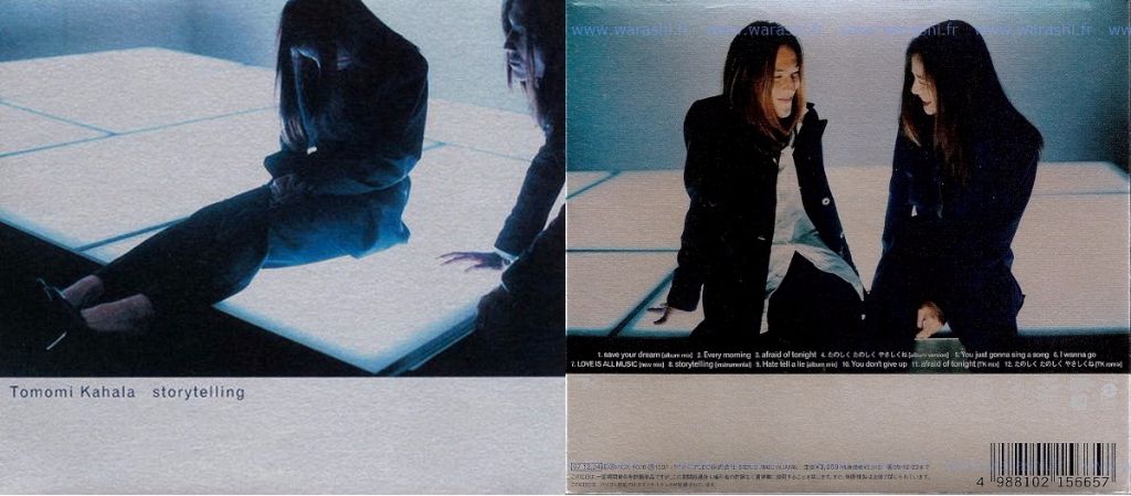
This cover, and album, is pretty sentimental to me because it was the first physical Japanese album I’ve ever owned. The theme of “storytelling” is actually quite cute and is spread into three different areas all across the album. On the albums slipcase cover Tomomi is seen brooding in a dimly lit room, the manner in which she’s sitting almost makes her look like a lost child. In the right hand corner we see Tetsuya Komuro creeping on her.
The cover is continued in a photo used for the back of the album. The two are seen happily gazing at each other in the same room, this time the lighting is overall much brighter and both of their faces are clearly visable. Tetsuya is the light of her life, he is the reason for her happiness. Perfect fit for an album full of catchy up-beat tunes and sentimental love songs.
The third and final part was used for the actual CD jewel case. The two can be seen holding hands wearing matching bracelets. Beautifully shot, simple, and it gets the point across. Design wise everything is very “clean”, right down to the font, a design philosophy that tends to always draw me in. The slipcase cover especially also has that cool 90s futuristic aesthetic that many artists and designers today take inspiration from.

This is one of those covers that look way better in person due to the materials of the album, making it very difficult to scan. The very shiny yet subtle holographic material used for the slipcase and album inserts give everything a beautiful and sleek finishing touch. Lastly, what I also love about “storytelling” is that the cover takes a very ominous turn when you consider the nature of their turbulent relationship, how he treated her, and the aftermath of it all.
hasawa
Karia Nomoto – Karly (2004)

“Karly” is an unique piece of art on many levels. First of all, its packaging : a 30+ pages hard cover photobook comes along with the CD (set inside) with a copious amount of polished photographs of Karia Nomoto in various settings, giving to this album a ‘premium’ asset setting it apart from any average CD album.
The art direction heavily inspired by the 60s (Andy Warhol’s “Factory”, Marcel Duchamp’s “readymade”, French pop movement ‘yéyé’ …) is the most fascinating I have ever seen on an albums visuals, working in perfect osmosis with the musical inspiration of the album. Karia Nomoto shows off her wonderful modelling skills with a nonchalant yet gracious pose and is dressed of only bright yellow tights that only HER would be capable of rocking that way. This album has been released 13 years ago and yet remains timeless along with Karia’s everlasting charisma. Exactly like style.
sou
MEG – CONTINUE (2013)
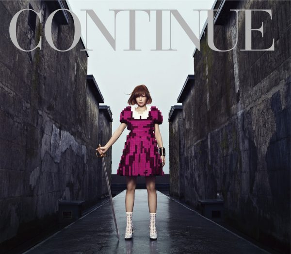
I’ve always been fan of the art direction MEG‘s albums have received: casual and simple, yet truly charming. Nonetheless, it’s the last chapter in her discography, CONTINUE, the one that truly shocked me, being it the one who stands out more amongst her other jacket arts.
This cover, showing MEG standing still on a path in a cold, ruined setting, embodies the contrasts and conflicts the album encloses. She is ready for battle, grabbing fiercely the sword, but she still looks tired; she has already fought her share. The ominous, dark and ruined atmosphere announces the classical, dramatic and symphonic sound tracks such as “prologue” or “clair de lune” features, but the computery, 8-bit dress MEG wears alludes to all the other electronic tunes present in tracks such as “Hanaretai no wa…” or “KISS OR BITE”. This dress also serves to express the retro-gaming concept the album is built on, but the setting also collaborates to it with the boxy corridor it configures. This corridor, supported by the figure of MEG, creates a symmetrical image only subtlety broken by her arms, one resting with a bracelet and the other grabbing the sword (also a couple of very RPGish items); again emphasizing the classical, ominous order, and how the CD is not all about it. Another contrast point to consider is the precious colour palette: several shades of grays and blues mix with much stronger pinks and purples, reinforcing the constant ambivalence this work thrives on.
Everything comes to its climax on the last track, which carries the same name as the full album, “CONTINUE”. In this last song, the cover art literally takes form of sound: pain, hope, synths, orchestra, tension, quietness; all is present in this defying ethereal track, urging us not to look back and continue forward, to continue fighting for your dreams, to continue defying already stablished standards and create your own path. Just as MEG‘s silhouette inspires in this magical cover art.
owatari
Do As Infinity – Ariadne no Ito (2011)

Ariadne no Ito was used as the theme song for the drama “Team Batista 3” and was the bands first drama tie-in in eight years. The single was also released to commemorate the band’s 12th anniversary. To keep in line with the celebrations, Do As Infinity released two very similar, but different covers for the single. The CD and CD+DVD cover have 12 differences between them in celebration of the band’s 12th anniversary.
Despite there being a lot going on in the pictures, the cover portrays a nice fantasy like image reminiscent of Mary Poppins. The bold colors help to catch your eye and the spot the difference game is a fun reminder of a game so many of us used to play as a child.
Ronald
YUKI – FLY (2014)

I picked the vinyl cover of YUKI’s 2014 album, “FLY.” It’s immediately eye-catching due to how sexual it is. She’s not really revealing anything, but it’s the positioning of her body. And then you notice her eyes. They’re locked onto the viewer. Together, it’s a very come hither look. I see it as a woman affirming her sexuality in a tongue in cheek way, rather than being a victim of it. It’s especially uplifting given that YUKI was 42 at the time this cover was created. Women her age are generally no longer seen as sexual beings, and this is especially true in Japan.
I was also hit by how much this reminded me of the work of American artist Richard Prince, specifically his “Girlfriends” series. This series features appropriated photographs from motorcycle magazines of bikers’ girlfriends sprawled out on their motorcycles. That series has a 70s trash element to it, but is also very specifically American. “Girlfriends” had a mixed reaction: some saw it as ironic due its mixing low and high culture, some saw it as a commentary on sexism, but others saw it as misogynistic or just plain tacky.
YUKI doing an homage to the Prince’s “Girlfriends” is right in line with his work, seeing as how he’s made a career out of appropriation. YUKI also plays into the different reactions the “Girlfriend” series received.
I also find it interesting how the most provocative cover was used for the least used format, as if she’s in a way guarding her sexuality, making it more exclusive.
What album (or single) cover is your absolute favorite? Tell us below!
Comments